
Подробное описание и демонстрация работы полосы прогресса под номером №60 для библиотеки Bootstrap. Html и CSS код для реализации progress bar’a на сайте как на изображении.
Демо Шкалы прогресса — стиль 60
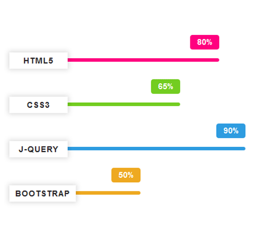
<div class="container">
<div class="row">
<div class="col-md-6">
<div class="progress pink">
<div class="progress-bar" style="width: 80%;">
<h3 class="progress-title">HTML5</h3>
<div class="progress-value">80%</div>
</div>
</div>

<div class="progress green">
<div class="progress-bar" style="width: 65%;">
<h3 class="progress-title">CSS3</h3>
<div class="progress-value">65%</div>
</div>
</div>
</div>
</div>
</div>
css разметка для реализации полосы прогресса
.progress{
height: 6px;
background: #fff;
border-radius: 0;
box-shadow: none;
margin-top: 70px;
overflow: visible;
}
.progress .progress-bar{
box-shadow: none;
border-radius: 5px;
position: relative;
animation: animate-positive 2s;
}
.progress .progress-title{
padding: 3px 10px;
margin: 0;
min-width: 100px;
font-size: 14px;
font-weight: 700;
color: #282828;
line-height: 22px;
letter-spacing: 1px;
text-align: center;
text-transform: uppercase;
background: #fff;
box-shadow: 0 0 8px 2px rgba(0, 0, 0, 0.14);
position: absolute;
top: -10px;
left: 0;
}
.progress .progress-value{
width: 50px;
height: 25px;
font-size: 14px;
font-weight: 600;
color: #fff;
line-height: 25px;
border-radius: 4px;
position: absolute;
top: -40px;
right: 0;
}
.progress.pink .progress-bar,
.progress.pink .progress-value{ background: #ff007f; }
.progress.green .progress-bar,
.progress.green .progress-value{ background: #73cd21; }
.progress.blue .progress-bar,
.progress.blue .progress-value{ background: #2e9ce0; }
.progress.yellow .progress-bar,
.progress.yellow .progress-value{ background: #eea921; }
@-webkit-keyframes animate-positive{
0%{ width: 0; }
}
@keyframes animate-positive{
0%{ width: 0; }
}