
Подробное описание и демонстрация работы полосы прогресса под номером №51 для библиотеки Bootstrap. Html и CSS код для реализации progress bar’a на сайте как на изображении.
Демо Шкалы прогресса — стиль 51
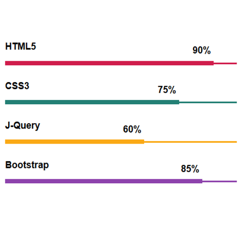
HTML5
CSS3
J-Query
Bootstrap
<div class="container">
<div class="row">
<div class="col-md-6">
<h3 class="progress-title">HTML5</h3>
<div class="progress pink">
<div class="progress-bar" style="width:90%; background:#d01d4c;">
<div class="progress-value">90%</div>
</div>
</div>

<h3 class="progress-title">CSS3</h3>
<div class="progress green">
<div class="progress-bar" style="width:75%; background:#248075;">
<div class="progress-value">75%</div>
</div>
</div>
</div>
</div>
</div>
css разметка для реализации полосы прогресса
.progress-title{
font-size: 18px;
font-weight: 700;
color: #000;
margin: 0 0 20px;
}
.progress{
height: 3px;
background: #8e44ad;
border-radius: 0;
margin-bottom: 30px;
overflow: visible;
box-shadow: none;
position: relative;
}
.progress .progress-bar{
height:8px;
position: relative;
top: -3px;
box-shadow: none;
animation: animate-positive 2s;
}
.progress .progress-value{
display: block;
font-size: 18px;
font-weight: bold;
color: #000;
position: absolute;
top: -30px;
right: 5px;
}
.progress.pink{
background: #d01d4c;
}
.progress.green{
background: #248075;
}
.progress.yellow{
background: #faa916;
}
@-webkit-keyframes animate-positive{
0% { width: 0%; }
}
@keyframes animate-positive{
0% { width: 0%; }
}