
Подробное описание и демонстрация работы полосы прогресса под номером №17 для библиотеки Bootstrap. Html и CSS код для реализации progress bar’a на сайте как на изображении.
Демо Шкалы прогресса — стиль 17
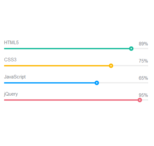
<div class="container">
<div class="row">
<div class="col-md-6">
<div class="progress_bar">
<div class="pro-bar">
<small class="progress_bar_title">
HTML5
<span class="progress_number">89%</span>
</small>
<span class="progress-bar-inner" style="background-color: #1abc9c; width: 89%;" data-value="89" data-percentage-value="89"></span>
</div>
</div>

<div class="progress_bar">
<div class="pro-bar">
<small class="progress_bar_title">
CSS3
<span class="progress_number">75%</span>
</small>
<span class="progress-bar-inner" style="background-color: #fdba04; width: 75%;" data-value="75" data-percentage-value="75"></span>
</div>
</div>
</div>
</div>
</div>
css разметка для реализации полосы прогресса
.progress_bar .pro-bar {
background: hsl(0, 0%, 97%);
box-shadow: 0 1px 2px hsla(0, 0%, 0%, 0.1) inset;
height:4px;
margin-bottom: 12px;
margin-top: 50px;
position: relative;
}
.progress_bar .progress_bar_title{
color: hsl(218, 4%, 50%);
font-size: 15px;
font-weight: 300;
position: relative;
top: -28px;
z-index: 1;
}
.progress_bar .progress_number{
float: right;
margin-top: -24px;
}
.progress_bar .progress-bar-inner {
background-color: hsl(0, 0%, 88%);
display: block;
width: 0;
height: 100%;
position: absolute;
top: 0;
left: 0;
transition: width 1s linear 0s;
}
.progress_bar .progress-bar-inner:before {
content: "";
background-color: hsl(0, 0%, 100%);
border-radius: 50%;
width: 4px;
height: 4px;
position: absolute;
right: 1px;
top: 0;
z-index: 1;
}
.progress_bar .progress-bar-inner:after {
content: "";
width: 14px;
height: 14px;
background-color: inherit;
border-radius: 50%;
position: absolute;
right: -4px;
top: -5px;
}