
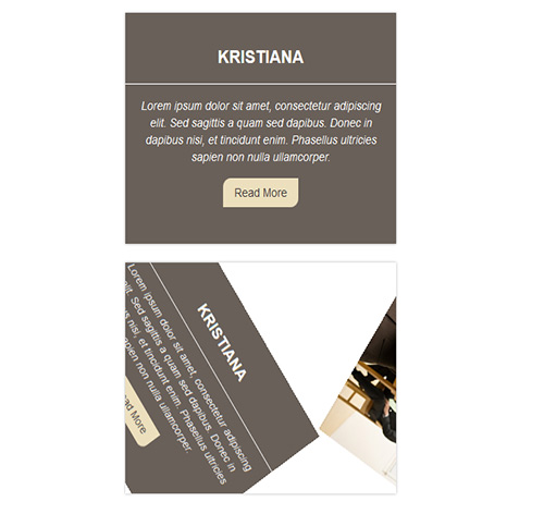
Подробное описание и демонстрацией работы эффекта наведения под номером №115 для бибилиотеки Bootstrap. Html и CSS код для реализации hover effect как на изображении.
Демонстрация эффекта наведения — стиль 115

Williamson
Lorem ipsum dolor sit amet, consectetur adipiscing elit. Sed sagittis a quam sed dapibus. Donec in dapibus nisi, et tincidunt enim. Phasellus ultricies sapien non nulla ullamcorper.
read more
Steve Thomas
Lorem ipsum dolor sit amet, consectetur adipiscing elit. Sed sagittis a quam sed dapibus. Donec in dapibus nisi, et tincidunt enim. Phasellus ultricies sapien non nulla ullamcorper.
read more<div class="container"> <div class="row"> <div class="col-md-4 col-sm-6"> <div class="box"> <img src="https://fokit.ru/demo/images/hover-effect/hover-effect-style-115/img-1.jpg" alt=""/> <div class="box-content"> <h3 class="title">Williamson</h3> <p class="description"> Lorem ipsum dolor sit amet, consectetur adipiscing elit. Sed sagittis a quam sed dapibus. Donec in dapibus nisi, et tincidunt enim. Phasellus ultricies sapien non nulla ullamcorper. </p> <a href="#" class="read-more">read more</a> </div> </div> </div> <div class="col-md-4 col-sm-6"> <div class="box"> <img src="https://fokit.ru/demo/images/hover-effect/hover-effect-style-115/img-2.jpg" alt=""/> <div class="box-content"> <h3 class="title">Kristiana</h3> <p class="description"> Lorem ipsum dolor sit amet, consectetur adipiscing elit. Sed sagittis a quam sed dapibus. Donec in dapibus nisi, et tincidunt enim. Phasellus ultricies sapien non nulla ullamcorper. </p> <a href="#" class="read-more">read more</a> </div> </div> </div> </div> </div>css разметка для реализации данного эффекта
.box{
text-align: center;
overflow: hidden;
position: relative;
box-shadow: 0 0 3px rgba(0, 0, 0, 0.3);
}
.box img{
width: 100%;
height: auto;
position: relative;
left: 0;
transition: all 0.3s ease 0s;
}
.box:hover img{
left: 100%;
transform: scale(0.7) rotateZ(180deg);
}
.box .box-content{
width: 100%;
height: 100%;
background: #696059;
position: absolute;
top: 0;
left: -100%;
transform: scale(0.7) rotateZ(180deg);
transition: all 0.3s ease 0s;
}
.box:hover .box-content{
left: 0;
transform: scale(1) rotateZ(0deg);
}
.box .title{
font-size: 21px;
font-weight: 700;
color: #fff;
text-transform: uppercase;
border-bottom: 1px solid #fff;
padding-bottom: 20px;
margin-top: 40px;
}
.box .description{
font-size: 14px;
font-style: italic;
color: #fff;
padding: 0 10px;
margin: 15px 0;
}
.box .read-more{
display: block;
width: 100px;
padding: 7px 0;
background: #ecdfbd;
border-radius: 10px 0 10px 0;
font-size: 14px;
color: #484141;
text-transform: capitalize;
margin: 0 auto;
transition: all 0.3s ease 0s;
}
.box .read-more:hover{
border-radius: 0 10px 0 10px;
}
@media only screen and (max-width:990px){
.box{ margin-bottom: 30px; }
}
@media only screen and (max-width:360px){
.box .title{
margin-top: 10px;
padding-bottom: 8px;
}
}