
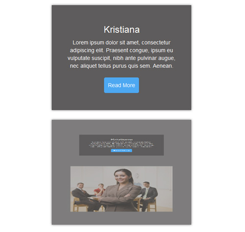
Подробное описание и демонстрацией работы эффекта наведения под номером №104 для бибилиотеки Bootstrap. Html и CSS код для реализации hover effect как на изображении.
Демонстрация эффекта наведения — стиль 104

Williamson
Lorem ipsum dolor sit amet, consectetur adipiscing elit. Praesent congue, ipsum eu vulputate suscipit, nibh ante pulvinar augue, nec aliquet tellus purus quis sem. Aenean.
read more
Steve Thomas
Lorem ipsum dolor sit amet, consectetur adipiscing elit. Praesent congue, ipsum eu vulputate suscipit, nibh ante pulvinar augue, nec aliquet tellus purus quis sem. Aenean.
read more<div class="container"> <div class="row"> <div class="col-md-4 col-sm-6"> <div class="box"> <img src="https://fokit.ru/demo/images/hover-effect/hover-effect-style-104/img-1.jpg" alt=""/> <div class="box-content"> <h3 class="title">Williamson</h3> <p class="description"> Lorem ipsum dolor sit amet, consectetur adipiscing elit. Praesent congue, ipsum eu vulputate suscipit, nibh ante pulvinar augue, nec aliquet tellus purus quis sem. Aenean. </p> <a href="#" class="read-more">read more</a> </div> </div> </div> <div class="col-md-4 col-sm-6"> <div class="box"> <img src="https://fokit.ru/demo/images/hover-effect/hover-effect-style-104/img-2.jpg" alt=""/> <div class="box-content"> <h3 class="title">Kristiana</h3> <p class="description"> Lorem ipsum dolor sit amet, consectetur adipiscing elit. Praesent congue, ipsum eu vulputate suscipit, nibh ante pulvinar augue, nec aliquet tellus purus quis sem. Aenean. </p> <a href="#" class="read-more">read more</a> </div> </div> </div> </div> </div>css разметка для реализации данного эффекта
.box{
text-align: center;
background: #7e7d7d;
box-shadow: 0 0 5px #7e7d7d;
overflow: hidden;
position: relative;
}
.box img{
width: 100%;
height: auto;
transition: all 0.35s ease 0s;
}
.box:hover img{
opacity: 0;
transform: rotateX(-100deg) translateY(50%) scale(0.5);
}
.box .box-content{
width: 100%;
height: 100%;
background: #5e5c5c;
position: absolute;
top: 0;
left: 0;
padding: 30px;
transform-origin: 50% 50% 0;
transform: rotateX(90deg) translateY(-100%) scale(0.5);
transition: all 0.35s ease 0s;
}
.box:hover .box-content{
opacity: 1;
transform: rotateX(0deg) translateY(0%) scale(1);
transition-delay: 0.35s;
}
.box .title{
font-size: 24px;
color: #fff;
text-transform: capitalize;
}
.box .description{
font-size: 14px;
color: #fff;
}
.box .read-more{
display: inline-block;
padding: 10px;
background: #4da8f2;
border-radius: 4px;
font-size: 14px;
color: #fff;
text-transform: capitalize;
margin-top: 10px;
transition: all 0.3s ease 0s;
}
.box .read-more:hover{
background: #048af7;
}
@media only screen and (max-width: 990px){
.box{ margin-bottom: 30px; }
}
@media only screen and (max-width: 479px){
.box .box-content{ padding: 10px; }
.box .title{ margin-top: 5px; }
.box .read-more{ margin-top: 5px; }
}