
Подробное описание и демонстрация работы блока о нас под номером №54 для библиотеки Bootstrap. Html и CSS код для реализации блока service box на сайте как на изображении.
Демо CSS блока о сервисе — стиль 54
заговолок
Это текст специально написан для демонстрации работы эффекта. Proin eu mauris libero. Proin finibus vulputate mauris eget venenatis.
подробнееСоздание сайтов
Это текст специально написан для демонстрации работы эффекта. Proin eu mauris libero. Proin finibus vulputate mauris eget venenatis.
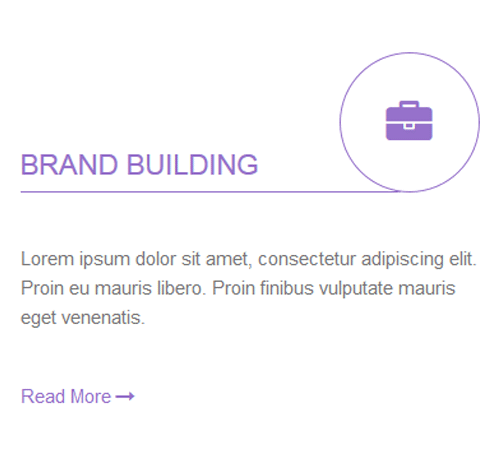
подробнееБрендирование
Это текст специально написан для демонстрации работы эффекта. Proin eu mauris libero. Proin finibus vulputate mauris eget venenatis.
подробнее<div class="container"> <div class="row"> <div class="col-md-4 col-sm-6"> <div class="serviceBox"> <h3 class="title">web design</h3> <div class="service-icon"> <i class="fa fa-globe"></i> </div> <p class="description"> Lorem ipsum dolor sit amet, consectetur adipiscing elit. Proin eu mauris libero. Proin finibus vulputate mauris eget venenatis. </p> <a href="#" class="read-more">read more <i class="fa fa-long-arrow-right"></i></a> </div> </div> <div class="col-md-4 col-sm-6"> <div class="serviceBox"> <h3 class="title">Web Development</h3> <div class="service-icon"> <i class="fa fa-rocket"></i> </div> <p class="description"> Lorem ipsum dolor sit amet, consectetur adipiscing elit. Proin eu mauris libero. Proin finibus vulputate mauris eget venenatis. </p> <a href="#" class="read-more">read more <i class="fa fa-long-arrow-right"></i></a> </div> </div> </div> </div>css разметка для реализации блока о компании
.serviceBox{
position: relative;
}
.serviceBox .title{
font-size: 22px;
font-weight: 400;
color: #272727;
text-transform: uppercase;
padding-top: 70px;
padding-bottom: 10px;
position: relative;
transition: all 0.3s ease-out 0s;
}
.serviceBox .title:after{
content: "";
width: 83%;
height: 1px;
background: #e4e4e4;
position: absolute;
bottom: 0;
left: 0;
transition: all 0.3s ease-out 0s;
}
.serviceBox .service-icon{
width: 110px;
height: 110px;
line-height: 110px;
border-radius: 50%;
background: #fff;
border: 1px solid #e4e4e4;
text-align: center;
font-size: 36px;
color: #272727;
padding: 0;
margin: 4px 0 0;
overflow: hidden;
position: absolute;
top: -10px;
right: 0;
transition: all 0.3s ease-out 0s;
}
.serviceBox .description{
font-size: 15px;
color: #777;
line-height: 23px;
margin: 40px 0;
}
.serviceBox .read-more{
font-size: 15px;
color: #272727;
text-transform: capitalize;
transition: all 0.3s ease-out 0s;
}
.serviceBox:hover .title,
.serviceBox:hover .service-icon,
.serviceBox:hover .read-more{
color: #9571c9;
}
.serviceBox:hover .service-icon{
border-color: #9571c9;
}
.serviceBox:hover .title:after{
background: #9571c9;
}
@media only screen and (max-width: 990px){
.serviceBox{ margin-bottom: 20px; }
}
@media only screen and (max-width: 767px){
.serviceBox .title:after{ width: 92%; }
}
@media only screen and (max-width: 500px){
.serviceBox .title{ font-size: 17px; }
.serviceBox .title:after{ width: 87%; }
.serviceBox .service-icon{ top: -15px; }
}
@media only screen and (max-width: 360px){
.serviceBox .title:after{ width: 84%; }
}