
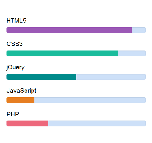
Подробное описание и демонстрация работы полосы прогресса под номером №9 для библиотеки Bootstrap. Html и CSS код для реализации progress bar’a на сайте как на изображении.
Демо Шкалы прогресса — стиль 9
<div class="container">
<div class="row">
<div class="col-sm-offset-2 col-sm-8">
<div class="progress_bar">
<h4>HTML5</h4>
<div class="progress">
<div class="progress_value value-90"></div>
</div>
</div>
</div>
</div>
</div>
css разметка для реализации полосы прогресса
.progress_bar {
margin-bottom:26px;
}
.progress_bar h4{
font-size:21px;
color: #000000;
}
.progress_bar .progress{
width: 100%;
background: rgba(8,102,220,.2);
overflow: hidden;
border-radius:5px;
}
.progress_value{
height: 1.66em;
float: left;
background: #9b59b6;
}
.progress_bar .green{
background: #1abc9c;
}
.progress_bar .dark-green{
background: #008b8b;
}
.progress_bar .orange{
background: #e67e22;
}
.progress_bar .pink{
background: #ed687c;
}
.value-00  { width: 0;    }
.value-10  { width: 10%;  }
.value-20  { width: 20%;  }
.value-30  { width: 30%;  }
.value-40  { width: 40%;  }
.value-50  { width: 50%;  }
.value-60  { width: 60%;  }
.value-70  { width: 70%;  }
.value-80  { width: 80%;  }
.value-90  { width: 90%;  }
.value-100 { width: 100%; }

/*----------keyframes---------*/

@-webkit-keyframes slideIn {
0% { width: 0; }
25% { width:100%; }
100% { width: 75%; }
}
@-moz-keyframes slideIn {
0% { width: 0; }
25% { width:100%; }
100% { width: 65%; }
}
@-ms-keyframes slideIn {
0% { width: 0; }
25% { width:100%; }
100% { width: 55%; }
}
@-o-keyframes slideIn {
0% { width: 0; }
25% { width:100%; }
100% { width: 45%; }
}
@keyframes slideIn {
0% { width: 0; }
25% { width:100%; }
100% { width: 35%; }
}
.progress_value {
animation: slideIn 2s;
}