
Подробное описание и демонстрация работы полосы прогресса под номером №65 для библиотеки Bootstrap. Html и CSS код для реализации progress bar’a на сайте как на изображении.
Демо Шкалы прогресса — стиль 65
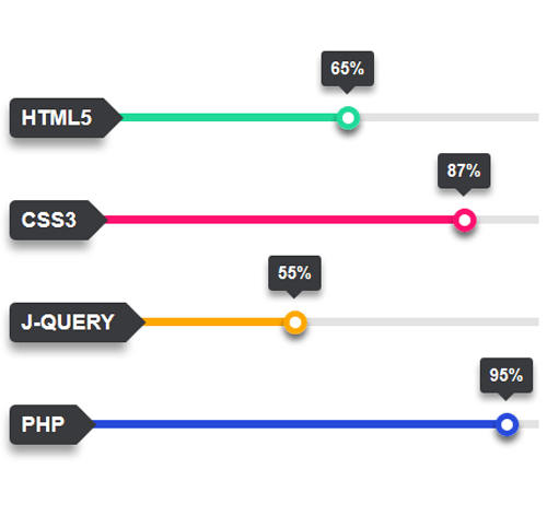
HTML5
CSS3
J-Query
PHP
<div class="container">
<div class="row">
<div class="col-md-6">
<div class="progress green">
<h3 class="progress-title">HTML5</h3>
<div class="progress-bar" style="width:65%; background:#21da9a;">
<div class="progress-value">65%</div>
</div>
</div>

<div class="progress pink">
<h3 class="progress-title">CSS3</h3>
<div class="progress-bar" style="width:87%; background:#ff1170;">
<div class="progress-value">87%</div>
</div>
</div>
</div>
</div>
</div>
css разметка для реализации полосы прогресса
.progress{
height: 7px;
background: #e3e3e3;
border-radius: 0;
box-shadow: none;
margin: 40px 0 80px;
overflow: visible;
position: relative;
}
.progress .progress-title{
padding: 7px 10px;
margin: 0;
background: #393a3d;
border-radius: 5px 0 0 5px;
box-shadow: 0 7px 7px rgba(0,0,0,0.4);
font-size: 18px;
font-weight: 700;
color: #fff;
text-transform: uppercase;
position: absolute;
top: -13px;
left: 0;
z-index: 1;
}
.progress .progress-title:after{
content: "";
border-left: 17px solid #393a3d;
border-top: 17px solid transparent;
border-bottom: 17px solid transparent;
position: absolute;
top: 0;
right: -17px;
}
.progress .progress-bar{
box-shadow: none;
border-radius: 0;
position: relative;
-webkit-animation: animate-positive 2s;
animation: animate-positive 2s;
}
.progress .progress-bar:after{
content: "";
width: 20px;
height: 20px;
border-radius: 50%;
box-shadow: 0 5px 5px rgba(0,0,0,0.6);
background: #fff;
position: absolute;
right: -5px;
top: -6px;
}
.progress .progress-value{
width: 45px;
height: 30px;
line-height: 30px;
border-radius: 3px;
background: #393a3d;
box-shadow: 0 5px 5px rgba(0,0,0,0.4);
font-size: 15px;
font-weight: 700;
color: #fff;
text-align: center;
position: absolute;
bottom: 30px;
right: -17px;
}
.progress .progress-value:after{
content: "";
border-top: 7px solid #393a3d;
border-left: 7px solid transparent;
border-right: 7px solid transparent;
position: absolute;
bottom: -7px;
left: 35%;
}
.progress.green .progress-bar:after{ border: 5px solid #21da9a; }
.progress.pink .progress-bar:after{ border: 5px solid #ff1170; }
.progress.blue .progress-bar:after{ border: 5px solid #294bdc; }
.progress.yellow .progress-bar:after{ border: 5px solid #ffa900; }
@-webkit-keyframes animate-positive{
0% { width: 0; }
}
@keyframes animate-positive{
0% { width: 0; }
}