
Подробное описание и демонстрация работы полосы прогресса под номером №62 для библиотеки Bootstrap. Html и CSS код для реализации progress bar’a на сайте как на изображении.
Демо Шкалы прогресса — стиль 62
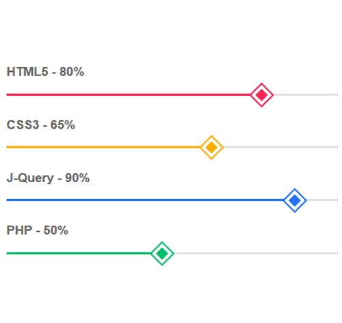
HTML5 — 80%
CSS3 — 65%
J-Query — 90%
PHP — 50%
<div class="container">
<div class="row">
<div class="col-md-6">
<h3 class="progress-title">HTML5 - 80%</h3>
<div class="progress pink">
<div class="progress-bar" style="width:80%; background:#f72754;"></div>
</div>

<h3 class="progress-title">CSS3 - 65%</h3>
<div class="progress yellow">
<div class="progress-bar" style="width:65%; background:#ffae03;"></div>
</div>
</div>
</div>
</div>
css разметка для реализации полосы прогресса
.progress-title{
font-size: 17px;
font-weight: 700;
color: #666;
margin: 0 0 20px;
}
.progress{
height: 3px;
background: #e4e3e3;
border-radius: 0;
box-shadow: none;
margin-bottom: 30px;
overflow: visible;
}
.progress .progress-bar{
box-shadow: none;
position: relative;
-webkit-animation: animate-positive 2s;
animation: animate-positive 2s;
}
.progress .progress-bar:after{
content: "";
width: 20px;
height: 20px;
border: 4px solid #fff;
position: absolute;
top: -8px;
right: 4px;
transform: rotate(45deg);
}
.progress.pink .progress-bar:after{
background: #f72754;
outline: 2px solid #f72754;
}
.progress.yellow .progress-bar:after{
background: #ffae03;
outline: 2px solid #ffae03;
}
.progress.blue .progress-bar:after{
background: #2272ff;
outline: 2px solid #2272ff;
}
.progress.green .progress-bar:after{
background: #00be69;
outline: 2px solid #00be69;
}
@-webkit-keyframes animate-positive {
0% { width: 0; }
}
@keyframes animate-positive {
0% { width: 0; }
}