
Подробное описание и демонстрация работы полосы прогресса под номером №41 для библиотеки Bootstrap. Html и CSS код для реализации progress bar’a на сайте как на изображении.
Демо Шкалы прогресса — стиль 41
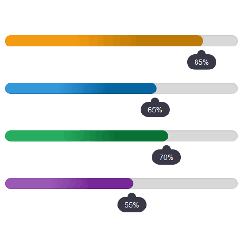
<div class="container">
<div class="row">
<div class="col-md-6">
<div class="progress">
<div class="progress-bar" style="width:85%; background:linear-gradient(to right, #f39c12 35%, #be7a07 68%);">
<div class="progress-value">85%</div>
</div>
</div>

<div class="progress">
<div class="progress-bar" style="width:65%; background:linear-gradient(to right, #3398da 35%, #0566a2 68%);">
<div class="progress-value">65%</div>
</div>
</div>
</div>
</div>
</div>
css разметка для реализации полосы прогресса
.progress{
height: 22px;
background: #d8d8d8;
border-radius: 20px;
overflow: visible;
margin-bottom: 70px;
}
.progress .progress-bar{
position: relative;
border-radius: 20px;
animation: animate-positive 2s;
}
.progress .progress-value{
position: absolute;
bottom: -45px;
right: -25px;
padding: 5px 14px;
background: #383846;
font-size: 14px;
color: #fff;
border-radius: 20px;
text-align: center;
}
.progress .progress-value:after{
content: "";
background: #383846;
padding: 8px;
border-radius: 50%;
position: absolute;
top: -8px;
left: 45%;
margin-left: -5px;
}
@-webkit-keyframes animate-positive{
0% { width: 0%; }
}
@keyframes animate-positive{
0% { width: 0%; }
}