
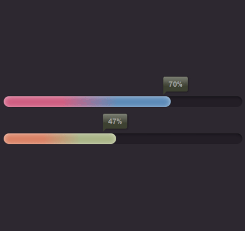
Подробное описание и демонстрация работы полосы прогресса под номером №21 для библиотеки Bootstrap. Html и CSS код для реализации progress bar’a на сайте как на изображении.
Демо Шкалы прогресса — стиль 21
<div class="container">
<div class="row">
<div class="col-md-6">
<div class="progress_bar">
<div class="pro-bar" style="width: 70%; background: linear-gradient(to right,  #cf5d81 35%,#5c8ab7 68%);">
<span>70%</span>
</div>
</div>

<div class="progress_bar">
<div class="pro-bar" style="width: 47%; background: linear-gradient(to right,#d98164 35%,#a9b487 68%);">
<span>47%</span>
</div>
</div>
</div>
</div>
</div>
css разметка для реализации полосы прогресса
.progress_bar{
height: 20px;
background-color:#231E26;
border-radius:15px;
box-shadow:0 4px 7px -5px #000 inset;
}
.progress_bar:first-child{
margin: 50px 0;
}
.progress_bar .pro-bar{
position: relative;
height: 100%;
box-shadow: 0 1px 11px -4px #fff inset;
border-radius:15px;
animation: animate-positive 4s;
}
.progress_bar .pro-bar > span{
background: linear-gradient(to top, #3d4131 35%, #fff 233%);
color: #a5a5a4;
box-shadow: 1px 1px  3px #1d1a1f;
font-size: 14px;
font-weight: 700;
position: absolute;
top: -37px;
right: -10%;
padding: 4px 10px;
border-radius: 3px 3px 3px 0px;
}
.progress_bar .pro-bar > span:after{
content: "";
border-top: 6px solid #3d4131;
border-right: 6px solid transparent;
position: absolute;
bottom: -6px;
left:0;
}
@-webkit-keyframes animate-positive {
0% { width: 0%;}
}
@keyframes animate-positive {
0% { width:0%; }
}