
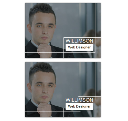
Подробное описание и демонстрацией работы эффекта наведения под номером №88 для бибилиотеки Bootstrap. Html и CSS код для реализации hover effect как на изображении.
Демонстрация эффекта наведения — стиль 88

willimson
заговолокer
Kristiana
Web developer
Steve Thomas
заговолокer<div class="container"> <div class="row"> <div class="col-md-4 col-sm-6"> <div class="box"> <img src="https://fokit.ru/demo/images/hover-effect/hover-effect-style-88/img-1.jpg" alt=""/> <div class="box-content"> <div class="box-content-inner"> <h3 class="title">willimson</h3> <span class="post">web designer</span> </div> </div> </div> </div> <div class="col-md-4 col-sm-6"> <div class="box"> <img src="https://fokit.ru/demo/images/hover-effect/hover-effect-style-88/img-2.jpg" alt=""/> <div class="box-content"> <div class="box-content-inner"> <h3 class="title">Kristiana</h3> <span class="post">Web developer</span> </div> </div> </div> </div> </div> </div>css разметка для реализации данного эффекта
.box{
background: #212121;
position: relative;
overflow: hidden;
color: #fff;
text-align: center;
box-shadow: 0 0 5px #555;
transition: all 0.55s ease;
}
.box img{
width: 100%;
height: auto;
transition: all 0.55s ease;
}
.box:hover img{
opacity: 0.5;
}
.box .box-content{
padding: 5px 10px 10px;
position: absolute;
bottom: 25px;
right: 25px;
}
.box .box-content:before,
.box .box-content:after{
content: "";
width: 767px;
height: 2px;
position: absolute;
background: #fff;
-webkit-transition: all 0.55s ease;
transition: all 0.55s ease;
}
.box .box-content:before{
top: 0;
left: 0;
-webkit-transform: translateX(100%);
transform: translateX(100%);
}
.box .box-content:after{
bottom: 0;
right: 0;
-webkit-transform: translateX(-100%);
transform: translateX(-100%);
}
.box .box-content-inner:before,
.box .box-content-inner:after{
content: "";
width: 2px;
height: 767px;
position: absolute;
background: #fff;
-webkit-transition: all 0.55s ease;
transition: all 0.55s ease;
}
.box .box-content-inner:before{
top: 0;
left: 0;
-webkit-transform: translateY(100%);
transform: translateY(100%);
}
.box .box-content-inner:after{
bottom: 0;
right: 0;
-webkit-transform: translateY(-100%);
transform: translateY(-100%);
}
.box:hover .box-content:before,
.box:hover .box-content:after,
.box:hover .box-content-inner:before,
.box:hover .box-content-inner:after{
-webkit-transform: translate(0, 0);
transform: translate(0, 0);
}
.box:hover .box-content:before,
.box:hover .box-content:after{
-webkit-transition-delay: 0.15s;
transition-delay: 0.15s;
}
.box .title{
font-size: 24px;
font-weight: 400;
margin: 0;
text-transform: uppercase;
}
.box .post{
display: block;
font-size: 16px;
font-weight: 700;
color: #434343;
padding: 5px 10px;
background: #fff;
text-transform: capitalize;
}
@media only screen and (max-width:990px){
.box{ margin-bottom: 30px; }
}