
Подробное описание и демонстрацией работы эффекта наведения под номером №70 для бибилиотеки Bootstrap. Html и CSS код для реализации hover effect как на изображении.
Демонстрация эффекта наведения — стиль 70

Williamson
заговолокer
Kristiana
Web Developer
Steve Thomas
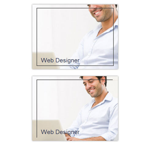
Graphic Designer<div class="container"> <div class="row"> <div class="col-md-4 col-sm-6"> <div class="box"> <div class="pic"> <img src="https://fokit.ru/demo/images/hover-effect/hover-effect-style-70/img-1.jpg"/> </div> <div class="box-content"> <h3 class="title">Williamson</h3> <span class="post">Web Designer</span> </div> </div> </div> <div class="col-md-4 col-sm-6"> <div class="box"> <div class="pic"> <img src="https://fokit.ru/demo/images/hover-effect/hover-effect-style-70/img-2.jpg"/> </div> <div class="box-content"> <h3 class="title">Kristiana</h3> <span class="post">Web Developer</span> </div> </div> </div> </div> </div>css разметка для реализации данного эффекта
.box{
position: relative;
overflow: hidden;
box-shadow: 0 0 5px #808080;
}
.box:before{
content: "";
position: absolute;
bottom: 5%;
left: 5%;
height: 0;
border-left: 2px solid #444;
z-index: 1;
transition: all 0.3s ease 0.9s;
}
.box:hover:before{
height: 90%;
transition: all 0.3s ease 0s;
}
.box:after{
content: "";
position: absolute;
top: 5%;
right: 5%;
height: 0;
border-right: 2px solid #444;
z-index: 1;
transition: all 0.3s ease 0.3s;
}
.box:hover:after{
height: 90%;
transition:all 0.3s ease 0.6s;
}
.box .pic:before{
content: "";
position: absolute;
top: 5%;
left: 5%;
width: 0;
border-bottom: 2px solid #444;
z-index: 1;
transition: all 0.3s ease 0.6s;
}
.box:hover .pic:before{
width: 90%;
transition: all 0.3s ease 0.3s;
}
.box .pic:after{
content: "";
position: absolute;
bottom: 5%;
right: 5%;
width: 0;
border-bottom: 2px solid #444;
z-index: 1;
transition: all 0.3s ease 0s;
}
.box:hover .pic:after{
width: 90%;
transition: all 0.3s ease 0.9s;
}
.box .pic img{
width: 100%;
height: auto;
transform: scale(1);
transition: all 2s ease 0s;
}
.box:hover .pic img{
transform: scale(2);
}
.box .box-content{
width: 80%;
position: absolute;
bottom: 25px;
left: 10%;
font-size: 25px;
}
.box .title,
.box .post{
font-size: 25px;
color: #3a3f58;
line-height: 25px;
margin: 0;
opacity: 1;
position: absolute;
left: 0;
bottom: 0;
transition: all 0.6s ease 0s;
}
.box:hover .title,
.box .post{
opacity: 0;
}
.box:hover .post{
opacity: 1;
}
@media only screen and (max-width: 990px){
.box{ margin-bottom: 20px; }
}