
Подробное описание и демонстрацией работы эффекта наведения под номером №63 для бибилиотеки Bootstrap. Html и CSS код для реализации hover effect как на изображении.
Демонстрация эффекта наведения — стиль 63

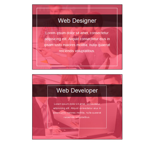
Web Developer
Lorem ipsum dolor sit amet, consectetur adipisicing elit. Aliquid consectetur eius in ipsam iusto maiores mollitia, nulla quaerat reiciendis voluptatibus.

Graphic Designer
Lorem ipsum dolor sit amet, consectetur adipisicing elit. Aliquid consectetur eius in ipsam iusto maiores mollitia, nulla quaerat reiciendis voluptatibus.
<div class="container">
<div class="row">
<div class="col-md-4 col-sm-6">
<div class="box">
<img src="https://fokit.ru/demo/images/hover-effect/hover-effect-style-63/img-1.jpg">
<h3 class="title">Web Designer</h3>
<div class="box-content">
<p class="description">
Lorem ipsum dolor sit amet, consectetur adipisicing elit. Aliquid consectetur eius in ipsam iusto maiores mollitia, nulla quaerat reiciendis voluptatibus.
</p>
</div>
</div>
</div>

<div class="col-md-4 col-sm-6">
<div class="box">
<img src="https://fokit.ru/demo/images/hover-effect/hover-effect-style-63/img-2.jpg">
<h3 class="title">Web Developer</h3>
<div class="box-content">
<p class="description">
Lorem ipsum dolor sit amet, consectetur adipisicing elit. Aliquid consectetur eius in ipsam iusto maiores mollitia, nulla quaerat reiciendis voluptatibus.
</p>
</div>
</div>
</div>
</div>
</div>
css разметка для реализации данного эффекта
.box{
border: 1px solid #000;
position: relative;
text-align: center;
}
.box:after{
content: "";
width: 100%;
height: 100%;
position: absolute;
top: 0;
left: 0;
background-color: rgba(0, 0, 0, 0.4);
transition: all 0.5s ease 0s;
}
.box:hover:after{
background-color: rgba(253, 65, 97, 0.7);
}
.box img{
width: 100%;
height: auto;
}
.box .title{
width: 100%;
padding: 12px 10px;
margin: 0;
position: absolute;
top: 35%;
left: 0;
font-size: 24px;
color: #fff;
background-color: rgba(0, 0, 0, 0.7);
z-index: 1;
transition: all 0.5s ease 0s;
}
.box:hover .title{
top: 15%;
}
.box .box-content{
width: 90%;
height: 90%;
border: 1px solid #fff;
position: absolute;
top: 5%;
left: 5%;
padding: 20px;
opacity: 0;
z-index: 1;
transform: scale(0);
transition: all 0.5s ease 0s;
}
.box:hover .box-content{
opacity: 1;
transform: scale(1);
}
.box .box-content:hover{
box-shadow: 0 0 20px #fff;
}
.box .description{
font-size: 14px;
color: #fff;
line-height: 24px;
position: relative;
top: 35%;
}
@media only screen and (max-width: 990px) {
.box{ margin-bottom: 20px; }
}
@media only screen and (max-width: 359px) {
.box .box-content{ padding: 5px; }
.box .title{
font-size: 22px;
padding: 5px;
}
.box .description{
line-height: 18px;
}
}