
Подробное описание и демонстрацией работы эффекта наведения под номером №57 для бибилиотеки Bootstrap. Html и CSS код для реализации hover effect как на изображении.
Демонстрация эффекта наведения — стиль 57

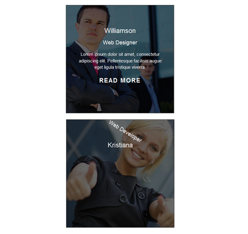
Williamson
заголовокLorem ipsum dolor sit amet, consectetur adipiscing elit. Pellentesque facilisis augue eget ligula tristique viverra.
read more
Kristiana
Web DeveloperLorem ipsum dolor sit amet, consectetur adipiscing elit. Pellentesque facilisis augue eget ligula tristique viverra.
read more
Steve Thomas
Graphic DesignerLorem ipsum dolor sit amet, consectetur adipiscing elit. Pellentesque facilisis augue eget ligula tristique viverra.
read more<div class="container"> <div class="row"> <div class="col-md-4 col-sm-6"> <div class="box"> <img src="https://fokit.ru/demo/images/hover-effect/hover-effect-style-57/img-1.jpg" alt=""/> <div class="box-content"> <h3 class="title">Williamson</h3> <span class="post">Web Designer</span> <p class="description"> Lorem ipsum dolor sit amet, consectetur adipiscing elit. Pellentesque facilisis augue eget ligula tristique viverra. </p> <a href="#" class="read">read more</a> </div> </div> </div> </div> </div>css разметка для реализации данного эффекта
.box{
border: 1px solid #333;
position: relative;
overflow: hidden;
}
.box img{
width: 100%;
height: auto;
}
.box .box-content{
width: 100%;
height: 100%;
position: absolute;
top: 0;
left: 0;
color: #fff;
text-align: center;
padding: 20% 20px;
background: rgba(0,0,0,0.6);
transform: rotate(-90deg);
transform-origin: left top 0;
transition: all 0.50s ease 0s;
}
.box .title{
display: inline-block;
font-size: 22px;
color: #fff;
margin: 0 0 15px 0;
position: relative;
transform: rotate(180deg);
transform-origin: right top 0;
transition: all .3s ease-in-out 0.2s;
}
.box .post{
display: block;
font-size: 18px;
margin-bottom: 15px;
transform: rotate(180deg);
transform-origin: right top 0;
transition: all .3s ease-in-out 0.4s;
}
.box .description{
font-size: 15px;
margin-bottom: 20px;
padding: 0 20px;
transform: rotate(180deg);
transform-origin: right top 0;
transition: all .3s ease-in-out 0.6s;
}
.box .read{
font-size: 20px;
font-weight: bold;
color: #fff;
display: block;
letter-spacing:2px;
text-transform: uppercase;
transform: rotate(180deg);
transform-origin: right top 0;
transition: all 0.3s ease-in-out 0.8s;
}
.box .read:hover{
color: #e8802e;
text-decoration: none;
}
.box:hover .box-content,
.box:hover .title,
.box:hover .post,
.box:hover .description,
.box:hover .read {
transform:rotate(0deg);
}
@media screen and (max-width: 990px){
.box{ margin-bottom:20px; }
}
@media screen and (max-width: 359px){
.box .box-content{ padding: 10% 20px; }
}