
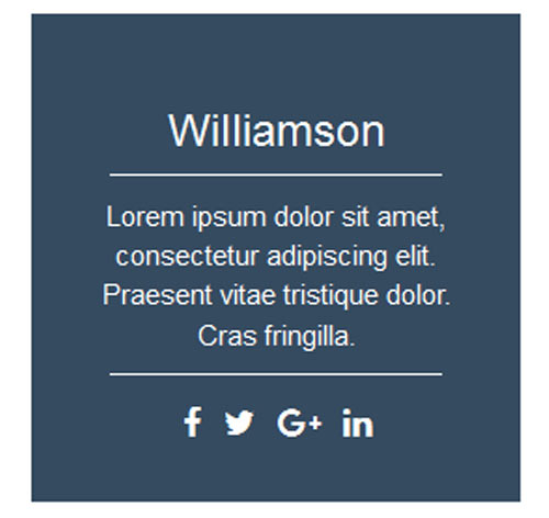
Подробное описание и демонстрацией работы эффекта наведения под номером №3 для бибилиотеки Bootstrap. Html и CSS код для реализации hover effect как на изображении.
html разметка для реализации данного эффекта<div class="container"> <div class="row"> <div class="col-md-3 col-sm-6"> <div class="box"> <div class="box-img"> <img src="images/img-1.jpg" alt=""/> </div> <div class="content"> <h3 class="title">williamson</h3> <p class="description"> Lorem ipsum dolor sit amet, consectetur adipiscing elit. Praesent vitae tristique dolor. Cras fringilla. </p> <ul class="social"> <li><a href="#"><i class="fab fa-facebook"></i></a></li> <li><a href="#"><i class="fab fa-twitter"></i></a></li> <li><a href="#"><i class="fab fa-google-plus"></i></a></li> <li><a href="#"><i class="fab fa-linkedin"></i></a></li> </ul> </div> </div> </div> </div> </div>css разметка для реализации данного эффекта
.box{
position: relative;
text-align: center;
color: #fff;
overflow: hidden;
}
.box-img{
position: relative;
bottom: 0;
left: 0;
width: 100%;
height: 100%;
transform: translate3d(0px, 0px, 0px);
transition: all 0.5s ease-in-out 0s;
}
.box-img img{
width: 100%;
height: auto;
}
.content{
position: absolute;
top:0;
left:0;
width: 100%;
height: 100%;
background: #354b60;
padding: 0 20px;
transform: translate3d(0px, 100%, 0px);
transition: all 0.5s ease-in-out 0s;
}
.title{
margin-top: 50px;
text-transform: capitalize;
}
.description{
font-size: 15px;
}
.title:after,
.description:after{
content: "";
display: block;
width: 80%;
border-bottom: 1px solid #fff;
margin: 0 auto;
padding-top: 10px;
}
.social{
padding: 0;
list-style: none;
margin-top: 13px;
}
.social > li{
display: inline-block;
}
.social > li > a{
color: #fff;
font-size: 18px;
padding: 0 4px;
}
.social > li > a:hover{
color:#47a2de;
}
.box:hover .box-img{
transform: translate3d(0px, -100%, 0px);
}
.box:hover .content{
transform: translate3d(0px, 0px, 0px);
}
@media only screen and (max-width: 990px){
.box{
margin-bottom: 20px;
}
}