
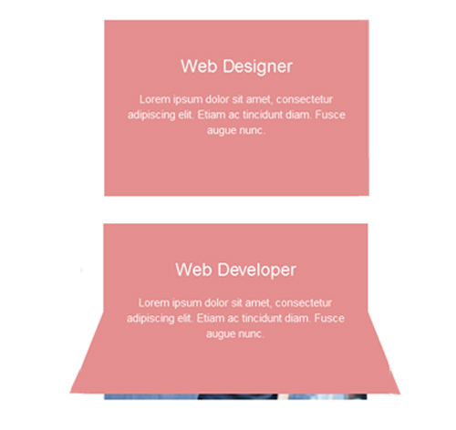
Подробное описание и демонстрацией работы эффекта наведения под номером №29 для бибилиотеки Bootstrap. Html и CSS код для реализации hover effect как на изображении.
Демонстрация эффекта наведения — стиль 29

Заголовок
Lorem ipsum dolor sit amet, consectetur adipiscing elit. Etiam ac tincidunt diam. Fusce augue nunc.

Lorem ipsum dolor
Lorem ipsum dolor sit amet, consectetur adipiscing elit. Etiam ac tincidunt diam. Fusce augue nunc.
<div class="container">
<div class="row">
<div class="col-md-4 col-sm-6">
<div class="box first">
<div class="over-layer"></div>
<img src="https://fokit.ru/demo/images/hover-effect/hover-effect-style-29/img-1.jpg" alt=""/>
<div class="box-content">
<h3 class="box-title">Web Designer</h3>
<p class="description">Lorem ipsum dolor sit amet, consectetur adipiscing elit. Etiam ac tincidunt diam. Fusce augue nunc.</p>
</div>
</div>
</div>
</div>
</div>
css разметка для реализации данного эффекта
.box{
position: relative;
}
.over-layer{
background-size: cover;
width: 100%;
height: 50%;
position: absolute;
top: 0;
left: 0;
transform: perspective(400px) rotateX(0deg) rotateY(0deg) rotateZ(0deg);
transform-origin: 50% 100% 0;
transition: all 1s ease 0s;
z-index: 1;
}
.box:hover .over-layer{
transform: perspective(400px) rotateX(-180deg) rotateY(0deg) rotateZ(0deg);
transform-origin: 50% 100% 0;
}
.over-layer:after{
content: "";
width: 100%;
height: 101%;
position: absolute;
top: 0;
left: 0;
transition: all 0.3s ease 0.2s;
}
.box:hover .over-layer:after{
background: #e48f8f;
}
.box img{
width: 100%;
height: auto;
}
.box-content{
width: 100%;
height: 100%;
position: absolute;
top: 0;
left: 0;
padding: 30px 20px;
text-align: center;
color:#fff;
overflow: hidden;
visibility: hidden;
z-index: 1;
transition: all 0.3s ease 0.2s;
}
.box:hover .box-content{
visibility: visible;
}
.box-content:before{
content: "";
width: 100%;
height: 50%;
position: absolute;
top:0;
left:0;
z-index: -1;
transition: all 0.3s ease 0.2s;
}
.box:hover .box-content:before{
background: #e48f8f;
}
.box-content .box-title{
transform: scale(0);
transition:all 1s ease 0s;
}
.box:hover .box-title{
transform: scale(1);
}
.box-content .description{
margin-top: 20px;
font-size: 15px;
opacity: 0;
transition:all 1s ease 0s;
}
.box:hover .description{
opacity: 1;
}
.first .over-layer{
background-image: url("../https://fokit.ru/demo/images/hover-effect/hover-effect-style-29/img-1.jpg");
}
.second .over-layer{
background-image: url("../https://fokit.ru/demo/images/hover-effect/hover-effect-style-29/img-2.jpg");
}
.third .over-layer{
background-image: url("../https://fokit.ru/demo/images/hover-effect/hover-effect-style-29/img-3.jpg");
}
@media only screen and (max-width: 990px){
.box{
margin-bottom:20px;
}
}