
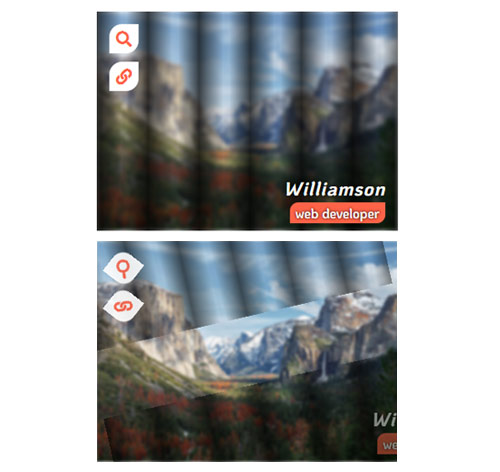
Подробное описание и демонстрацией работы эффекта наведения под номером №224 для бибилиотеки Bootstrap. Html и CSS код для реализации hover effect как на изображении.

<!-- <link rel="stylesheet" href="https://stackpath.bootstrapcdn.com/font-awesome/4.7.0/css/font-awesome.min.css /> -->
<div class="container">
<div class="row">
<div class="col-md-4 col-sm-6">
<div class="box">
<img src="https://fokit.ru/demo/images/hover-effect/hover-effect-style-224/img-1.jpg" alt="">
<div class="box-content">
<div class="content">
<h3 class="title">Steve Thomas</h3>
<span class="post">web developer</span>
</div>
<ul class="icon">
<li><a href="#"><i class="fa fa-search"></i></a></li>
<li><a href="#"><i class="fa fa-link"></i></a></li>
</ul>
</div>
</div>
</div>
<div class="col-md-4 col-sm-6">
<div class="box">
<img src="https://fokit.ru/demo/images/hover-effect/hover-effect-style-224/img-2.jpg" alt="">
<div class="box-content">
<div class="content">
<h3 class="title">Kristina</h3>
<span class="post">web designer</span>
</div>
<ul class="icon">
<li><a href="#"><i class="fa fa-search"></i></a></li>
<li><a href="#"><i class="fa fa-link"></i></a></li>
</ul>
</div>
</div>
</div>
</div>
</div>
css разметка для реализации данного эффекта
:root{ --main-color: #ff6348; }
.box{
font-family: 'KoHo', sans-serif;
position: relative;
overflow: hidden;
}
.box:before,
.box:after{
content: '';
background: repeating-linear-gradient(90deg,rgba(0,0,0,0.7), transparent 8%,
transparent 10%, rgba(0,0,0,0.7) 17%);
height: 50%;
width: 100%;
opacity: 0;
transform: rotate(-90deg);
transform-origin: left bottom;
position: absolute;
left: 0;
top: 0;
z-index: 1;
transition: all 0.25s ease-in-out;
}
.box:after{
transform: rotate(-90deg);
transform-origin: top right;
top: auto;
bottom: 0;
}
.box:hover:before,
.box:hover:after{
opacity: 1;
transform: rotate(0);
}
.box img{
width: 100%;
height: auto;
transition: all .5s ease-out;
}
.box:hover img{ filter: hue-rotate(10deg) blur(2px); }
.box .box-content{
height: 100%;
width: 100%;
transform: translateX(-50%) translateY(-50%);
position: absolute;
top: 50%;
left: 50%;
z-index: 2;
}
.box .content{
color: #fff;
text-align: right;
opacity: 0;
position: absolute;
right: -50%;
bottom: 10px;
z-index: 2;
transition: all 0.3s ease 0.1s;
}
.box:hover .content{
right: 15px;
opacity: 1;
}
.box .title{
font-size: 23px;
font-weight: 700;
font-style: italic;
text-transform: capitalize;
letter-spacing: 1px;
text-shadow: 0 0 5px #000;
margin: 0 0 5px;
}
.box .post{
background-color: var(--main-color);
font-size:16px;
font-weight: 600;
text-shadow: 0 0 3px #000;
padding: 2px 7px;
margin: 0 0 7px;
border-radius: 10px 0;
}
.box .icon{
text-align: center;
padding: 0;
margin: 0;
list-style: none;
position: absolute;
left: 15px;
top: 15px;
z-index: 2;
transition: all 0.3s ease 0.3s;
}
.box .icon li{
margin: 0 0 10px;
opacity: 0;
transform: rotate(360deg);
transition: all 0.3s;
}
.box:hover .icon li{
opacity: 1;
transform: rotate(0);
}
.box .icon li a{
color: var(--main-color);
background: #fff;
font-size: 19px;
line-height: 35px;
width: 35px;
height: 35px;
border-radius:15px 0;
display: block;
transition:all 0.3s ease 0s;
}
.box .icon li a:hover{
color: var(--main-color);
box-shadow: 0 0 10px var(--main-color) inset;
}
@media only screen and (max-width:990px){
.box{ margin-bottom: 30px; }
}
@media only screen and (max-width:479px){
.box .title{ font-size: 20px; }
}