
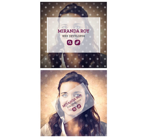
Подробное описание и демонстрацией работы эффекта наведения под номером №213 для бибилиотеки Bootstrap. Html и CSS код для реализации hover effect как на изображении.


<!-- <link rel="stylesheet" href="https://stackpath.bootstrapcdn.com/font-awesome/4.7.0/css/font-awesome.min.css /> -->
<div class="container">
<div class="row">
<div class="col-md-4 col-sm-6">
<div class="box">
<img src="https://fokit.ru/demo/images/hover-effect/hover-effect-style-213/img-1.jpg" alt="">
<div class="box-content">
<h3 class="title">Williamson</h3>
<span class="post">Web designer</span>
<ul class="icon">
<li><a href="#"><i class="fa fa-search"></i></a></li>
<li><a href="#"><i class="fa fa-link"></i></a></li>
</ul>
</div>
</div>
</div>
<div class="col-md-4 col-sm-6">
<div class="box">
<img src="https://fokit.ru/demo/images/hover-effect/hover-effect-style-213/img-2.jpg" alt="">
<div class="box-content">
<h3 class="title">Miranda Roy</h3>
<span class="post">Web developer</span>
<ul class="icon">
<li><a href="#"><i class="fa fa-search"></i></a></li>
<li><a href="#"><i class="fa fa-link"></i></a></li>
</ul>
</div>
</div>
</div>
</div>
</div>
css разметка для реализации данного эффекта
.box{
font-family: 'Zilla Slab', serif;
overflow: hidden;
position: relative;
}
.box:before{
content: '';
height: 100%;
width: 100%;
background-image:
radial-gradient(circle at 25% 25%, rgba(255,255,255,0.2) 10%, transparent 15%),
radial-gradient(circle at 75% 75%, rgba(255,255,255,0.4) 10%, transparent 15%);
background-size: 40px 40px;
transform: translateX(-50%) scale(2);
opacity: 0;
position: absolute;
left: 50%;
top: 0;
z-index: 1;
transition: all 0.3s ease 0s;
}
.box:hover:before{
transform: translateX(-50%) scale(1);
opacity: 1;
}
.box:after{
content: '';
height: 100%;
width: 100%;
background: radial-gradient(transparent,rgba(0,0,0,0.7));
transform: scale(2);
opacity: 0;
position: absolute;
left: 0;
top: 0;
transition: all 0.3s ease 0.1s;
}
.box:hover:after{
transform: scale(1);
opacity: 1;
}
.box img{
width: 100%;
height: auto;
transition: all 0.3s ease 0s;
}
.box .box-content{
color: #6F1E51;
background-color: rgba(255,255,255,0.7);
text-align: center;
width: 80%;
padding: 40px 20px;
border-left: 4px solid #fff;
border-right: 4px solid #fff;
transform:translateX(-50%) translateY(-50%) scale(0.2) rotate(-90deg);
opacity: 0;
position: absolute;
left: 50%;
top: 50%;
z-index: 2;
transition: all 0.3s ease 0s;
}
.box:hover .box-content{
transform: translateX(-50%) translateY(-50%) scale(1) rotate(0);
opacity: 1;
}
.box .title{
font-size: 25px;
font-weight: 700;
text-transform: uppercase;
text-shadow: 0 0 2px #fff;
margin-bottom: 5px;
}
.box .post{
color: #000;
font-size:14px;
font-weight: 500;
letter-spacing: 1px;
text-transform: uppercase;
margin-bottom: 10px;
display: block;
}
.box .icon{
list-style: none;
text-align: center;
padding: 0;
margin: 0;
}
.box .icon li{
margin:0 4px;
display: inline-block;
}
.box .icon li a{
color: #fff;
background-color: #6F1E51;
font-size: 17px;
text-align: center;
line-height: 30px;
width: 30px;
height: 30px;
border-radius:10px;
display: block;
transition:all 0.3s ease 0s;
}
.box .icon li a:hover{
color: #6F1E51;
background-color: #fff;
box-shadow: 0 0 5px #6F1E51 ;
}
@media only screen and (max-width:990px){
.box{ margin-bottom: 30px; }
}
@media only screen and (max-width:479px){
.box .title{ font-size: 20px; }
}