
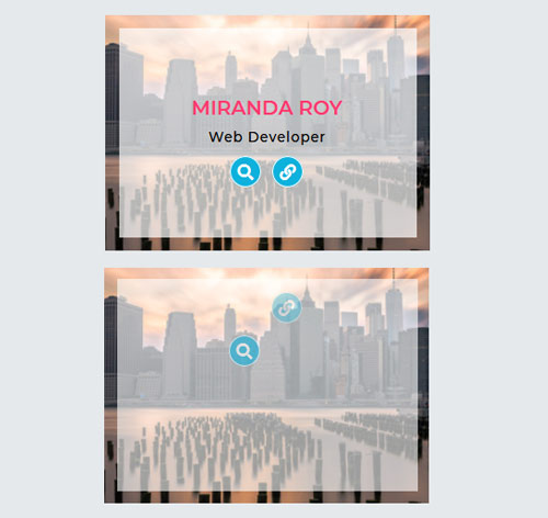
Подробное описание и демонстрацией работы эффекта наведения под номером №212 для бибилиотеки Bootstrap. Html и CSS код для реализации hover effect как на изображении.


<!-- <link rel="stylesheet" href="https://stackpath.bootstrapcdn.com/font-awesome/4.7.0/css/font-awesome.min.css /> -->
<div class="container">
<div class="row">
<div class="col-md-4 col-sm-6">
<div class="box">
<img src="https://fokit.ru/demo/images/hover-effect/hover-effect-style-212/img-1.jpg" alt="">
<div class="box-content">
<div class="content">
<h3 class="title">Williamson</h3>
<span class="post">Web designer</span>
<ul class="icon">
<li><a href="#"><i class="fa fa-search"></i></a></li>
<li><a href="#"><i class="fa fa-link"></i></a></li>
</ul>
</div>
</div>
</div>
</div>
<div class="col-md-4 col-sm-6">
<div class="box">
<img src="https://fokit.ru/demo/images/hover-effect/hover-effect-style-212/img-2.jpg" alt="">
<div class="box-content">
<div class="content">
<h3 class="title">Miranda Roy</h3>
<span class="post">Web developer</span>
<ul class="icon">
<li><a href="#"><i class="fa fa-search"></i></a></li>
<li><a href="#"><i class="fa fa-link"></i></a></li>
</ul>
</div>
</div>
</div>
</div>
</div>
</div>
css разметка для реализации данного эффекта
.box{
font-family: 'Montserrat', sans-serif;
overflow: hidden;
position: relative;
}
.box:before{
content: '';
background-color: rgba(255,255,255,0.7);
opacity: 0;
position: absolute;
left: 0;
right: 0;
bottom: 0;
top: 0;
z-index: 1;
transition: all 0.3s ease 0.1s;
}
.box:hover:before{
left: 15px;
right: 15px;
bottom: 15px;
top: 15px;
opacity: 1;
animation:bounce-left 1s ease-in forwards;
}
.box img{
width: 100%;
height: auto;
transition: all 0.3s ease 0s;
}
.box:hover img{ transform: scale(1.5); }
.box .box-content{
color: #fff;
text-align: center;
width: 100%;
height: 100%;
transform:translateX(-50%) translateY(-50%) scale(1);
position: absolute;
left: 50%;
top: 50%;
z-index: 2;
transition:all 0.3s ease 0.5s;
}
.box .content{
opacity: 0;
transform:translateX(-50%) translateY(-50%);
position: absolute;
left:50%;
top:50%;
z-index: 2;
transition:all 0.3s ease 0s;
}
.box:hover .content{ opacity: 1; }
.box .title{
color: #ff3a6f;
font-size: 22px;
font-weight: 600;
text-transform: uppercase;
transform: translateY(-500px);
opacity: 0;
transition:all 0.8s ease 0.3s;
}
.box .post{
color: #000;
font-size:15px;
font-weight: 500;
letter-spacing: 1px;
text-transform: capitalize;
display: inline-block;
margin-bottom: 10px;
opacity: 0;
transform:translateY(-500px);
transition:all 0.8s ease 0.15s;
}
.box:hover .title,
.box:hover .post{
opacity: 1;
transform:translateY(0);
}
.box .icon{
list-style: none;
text-align: center;
padding: 0;
margin: 0;
}
.box .icon li{
margin:0 4px;
opacity: 0;
display: inline-block;
transform: translateY(-200px);
transition: all 0.8s ease 0s;
}
.box .icon li:nth-child(2){ transition-delay: 0.1s; }
.box:hover .icon li{
opacity: 1;
transform: translateY(0);
}
.box .icon li a{
color: #fff;
background-color: #0eb1dc;
font-size: 18px;
line-height: 33px;
height: 35px;
width: 35px;
border: 2px solid #fff;
border-radius: 50%;
display: block;
transition: all 0.3s ease 0s;
}
.box .icon li a:hover{
color: #fff;
background-color: #ff3a6f;
box-shadow: 0 0 15px #ff3a6f;
}
@keyframes bounce-left{
25%,50%,75%,100%{ transform:translateX(0); }
40%{ transform:translateX(30px); }
70%{ transform:translateX(15px); }
90%{ transform:translateX(5px); }
}
@media only screen and (max-width:990px){
.box{ margin-bottom: 30px; }
}
@media only screen and (max-width:479px){
.box .title{ font-size: 18px; }
}