
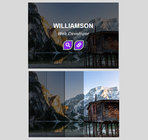
Подробное описание и демонстрацией работы эффекта наведения под номером №204 для бибилиотеки Bootstrap. Html и CSS код для реализации hover effect как на изображении.


<div class="demo">
<div class="container">
<div class="row">
<div class="col-md-4 col-sm-6">
<div class="box">
<img src="https://fokit.ru/demo/images/hover-effect/hover-effect-style-204/img-1.jpg" alt="">
<div class="box-overlay"></div>
<div class="box-content">
<div class="inner-content">
<h3 class="title">Williamson</h3>
<span class="post">Web Developer</span>
<ul class="icon">
<li><a href="#"><i class="fa fa-search"></i></a></li>
<li><a href="#"><i class="fa fa-link"></i></a></li>
</ul>
</div>
</div>
</div>
</div>
<div class="col-md-4 col-sm-6">
<div class="box">
<img src="https://fokit.ru/demo/images/hover-effect/hover-effect-style-204/img-2.jpg" alt="">
<div class="box-overlay"></div>
<div class="box-content">
<div class="inner-content">
<h3 class="title">Kristiana</h3>
<span class="post">Web Designer</span>
<ul class="icon">
<li><a href="#"><i class="fa fa-search"></i></a></li>
<li><a href="#"><i class="fa fa-link"></i></a></li>
</ul>
</div>
</div>
</div>
</div>
</div>
</div>
</div>
css разметка для реализации данного эффекта
.demo{ background: #d9d9d9; }
.box{
overflow: hidden;
position: relative;
}
.box img{
width: 100%;
height: auto;
}
.box .box-content{
width: 100%;
height: 100%;
position: absolute;
top: 0;
left: 0;
transition: all 0.3s ease 0.5s;
}
.box:before,
.box:after,
.box .box-content:before,
.box .box-content:after,
.box .box-overlay{
content: "";
width: 20%;
height: 100%;
background: rgba(0,0,0,0.6);
position: absolute;
top: 0;
left: 0;
opacity: 0;
transform: scale(1.2);
transition: all 0.3s ease 0.1s;
}
.box:after{
left: 20%;
transition-delay: 0.2s;
}
.box .box-content:before{
left: 40%;
transition-delay: 0.3s;
}
.box .box-content:after{
left: 60%;
transition-delay: 0.4s;
}
.box .box-overlay{
left: 80%;
transition-delay: 0.5s;
}
.box:hover:before,
.box:hover:after,
.box:hover .box-content:before,
.box:hover .box-content:after,
.box:hover .box-overlay{
opacity: 1;
transform: scale(1);
}
.box .inner-content{
width: 100%;
color: #fff;
text-align: center;
position: absolute;
top: 50%;
left: 50%;
opacity: 0;
z-index: 1;
transform: translate(-50%, -50%) scale(1.5);
transition: all 0.3s ease 0.5s;
}
.box:hover .inner-content{
opacity: 1;
transform: translate(-50%, -50%) scale(1);
}
.box .title{
font-size: 25px;
font-weight: 600;
text-transform: uppercase;
margin: 0;
}
.box .post{
display: inline-block;
font-size: 16px;
font-style: italic;
letter-spacing: 1px;
text-transform: capitalize;
margin: 5px 0 20px 0;
}
.box .icon{
padding: 0;
margin: 0;
list-style: none;
}
.box .icon li{
display: inline-block;
margin: 0 5px;
}
.box .icon li a{
display: block;
width: 30px;
height: 30px;
line-height:30px;
border-radius: 50% 0;
background: #8421ef;
font-size: 18px;
color: #fff;
box-shadow: 0 0 0 2px rgba(0,0,0,0.5),0 0 0 4px rgba(255,255,255,0.8);
transition: all 0.3s ease 0s;
}
.box .icon li a:hover{
background: #fff;
color: #8421ef;
box-shadow: 0 0 15px rgba(0,0,0,0.5) inset,0 0 10px #fff;
}
@media only screen and (max-width:990px){
.box{ margin-bottom: 30px; }
}