
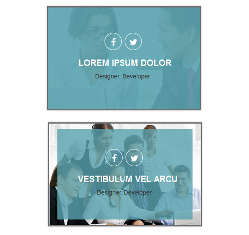
Подробное описание и демонстрацией работы эффекта наведения под номером №15 для бибилиотеки Bootstrap. Html и CSS код для реализации hover effect как на изображении.
Демонстрация эффекта наведения — стиль 15


<div class="container">
<div class="row">
<div class="col-md-4 col-sm-6">
<div class="box">
<img src="https://fokit.ru/demo/images/hover-effect/hover-effect-style-15/img-1.jpg" alt="">
<span class="over-layer"></span>

<ul class="social-links">
<li><a href="#"><i class="fab fa-facebook"></i></a></li>
<li><a href="#"><i class="fab fa-twitter"></i></a></li>
</ul>

<h3 class="title"><a href="#">Lorem ipsum dolor</a></h3>
<ul class="post">
<li><a href="#">Designer</a>,</li>
<li><a href="#">Developer</a></li>
</ul>
</div>
</div>
</div>
</div>
css разметка для реализации данного эффекта
.box{
border:3px solid #6f6f6f;
box-shadow:0px 0px 3px #a9a9a9;
position:relative;
overflow: hidden;
}
.box img{
width:100%;
height: auto;
}
.box .over-layer{
position:absolute;
top:0;
width:100%;
height:100%;
background:rgba(89, 162, 174, 0.9);
opacity:0;
transform:scale(0,0);
display: block;
transition: all 0.30s linear;
}
.box:hover .over-layer{
opacity:1;
transform:scale(1,1);
}
.box .social-links{
position: absolute;
top:25%;
text-align: center;
padding:0;
margin:0;
width:100%;
}
.box .social-links li{
list-style:none;
display:inline-block;
margin-right:1%;
}
.box .social-links li a{
display: block;
width: 40px;
height: 40px;
border: 1px solid #fff;
border-radius: 50px;
font-size: 20px;
line-height: 40px;
color:#fff;
opacity:0;
transform:scale(0.7,0.7);
transition:all 0.3s ease 0s;
}
.box .social-links li a:hover{
color:#3498db;
background: #fff;
}
.box:hover .social-links li a{
opacity:1;
transform:scale(1,1);
}
.box .title{
margin:0;
}
.box .title a{
position: absolute;
top: 50%;
left: -100%;
color:#fff;
font-size:20px;
font-weight: bold;
text-transform: uppercase;
opacity:0;
transition:all 0.5s ease 0s;
}
.box:hover .title a{
left:20%;
opacity:1;
}
.box .post{
position: absolute;
bottom:28%;
right:-60%;
width:60%;
padding:0;
margin:0;
opacity:0;
transition:all 0.3s ease 0s;
}
.box .post li{
display:inline-block;
list-style:none;
}
.box .post li a{
color:#333;
transition:all 0.3s ease 0s;
}
.box .post li a:hover{
text-decoration:none;
color:#fff;
}
.box:hover .post{
right:9%;
opacity:1;
}
@media only screen and  (max-width:990px){
.box{
margin-bottom: 15px;
}
}
@media only screen and (max-width: 767px) {
.box:hover .title a{
top:40%;
left:35%;
}
.box:hover .post{
right:-1%;
bottom: 46%;
}
}
@media only screen and (max-width: 480px) {
.box:hover .title a{
top:45%;
left: 25%;
}
.box:hover .post{
right: 5%;
bottom: 35%;
}
}
@media only screen and (max-width: 479px) {
.box:hover .title a{
top:47%;
left: 19%;
}
.box:hover .post{
right: 8%;
bottom: 30%;
}
}