
Подробное описание и демонстрацией работы эффекта наведения под номером №149 для бибилиотеки Bootstrap. Html и CSS код для реализации hover effect как на изображении.
html разметка для реализации данного эффекта


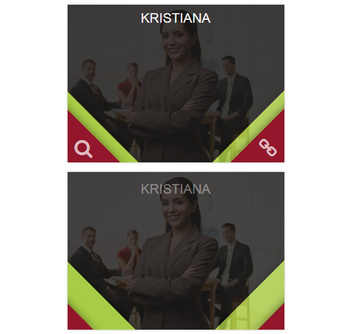
<div class="container">
<div class="row">
<div class="col-md-4 col-sm-6">
<div class="box">
<img src="https://fokit.ru/demo/images/hover-effect/hover-effect-style-149/img-1.jpg" alt=""/>
<div class="box-content">
<a href="#" class="left-icon fa fa-search"></a>
<a href="#" class="right-icon fa fa-link"></a>
<h3 class="title">Williamson</h3>
</div>
</div>
</div>

<div class="col-md-4 col-sm-6">
<div class="box">
<img src="https://fokit.ru/demo/images/hover-effect/hover-effect-style-149/img-2.jpg" alt=""/>
<div class="box-content">
<a href="#" class="left-icon fa fa-search"></a>
<a href="#" class="right-icon fa fa-link"></a>
<h3 class="title">Kristiana</h3>
</div>
</div>
</div>
</div>
</div>
css разметка для реализации данного эффекта
.box{
background: #1b1a1a;
text-align: center;
overflow: hidden;
box-shadow: 0 0 3px rgba(0,0,0,0.3);
position: relative;
}
.box img{
width: 100%;
height: auto;
transition: all 0.35s ease-in-out 0s;
}
.box:hover img{ opacity: 0.15; }
.box .box-content{
width: 100%;
height: 100%;
position: absolute;
top: 0;
left: 0;
}
.box:before,
.box:after,
.box .box-content:before,
.box .box-content:after{
content: "";
width: 120px;
height: 120px;
box-shadow: 0 0 20px rgba(0,0,0,0.5);
position: absolute;
bottom: 0;
right: 0;
transition: all 0.35s ease 0.2s;
}
.box .box-content:before,
.box .box-content:after{
right: auto;
left: 0;
}
.box:before,
.box .box-content:before{
background: #a8cc46;
border-right: 1px solid #a8cc46;
transform: skew(-44deg) translateX(150%);
transition: all 0.35s ease-in-out 0s;
}
.box .box-content:before{ transform: skew(44deg) translateX(-150%); }
.box:after,
.box .box-content:after{
background: #93162b;
border-right: 1px solid #93162b;
transform: skew(-44deg) translateX(175%);
transition: all 0.35s ease-in-out 0s;
}
.box .box-content:after{ transform: skew(44deg) translateX(-175%); }
.box:hover:before{
transition-delay: 0s;
transform: skew(-45deg) translateX(50%);
}
.box:hover:after{
transition-delay: 0.1s;
transform: skew(-45deg) translateX(75%);
}
.box:hover .box-content:before{
transition-delay: 0s;
transform: skew(45deg) translateX(-52%);
}
.box:hover .box-content:after{
transition-delay: 0.1s;
transform: skew(45deg) translateX(-77%);
}
.box .left-icon,
.box .right-icon{
font-size: 32px;
color: #fff;
opacity: 0;
position: absolute;
bottom: 7px;
left: 12px;
z-index: 1;
transition: all 0.35s ease-in-out 0s;
}
.box .right-icon{
left: auto;
right: 12px;
}
.box:hover .left-icon,
.box:hover .right-icon{
opacity: 0.7;
transition-delay: 0.3s;
}
.box .title{
width: 100%;
padding: 10px 15px;
margin: 0;
font-size: 22px;
font-weight: 500;
color: #fff;
text-transform: uppercase;
opacity: 0;
position: absolute;
top: 10px;
left: 0;
transition: all 0.35s ease-in-out 0.15s;
}
.box:hover .title{
top: 0;
opacity: 1;
}
@media only screen and (max-width:990px){
.box{ margin-bottom: 20px; }
}