
Подробное описание и демонстрацией работы эффекта наведения под номером №142 для бибилиотеки Bootstrap. Html и CSS код для реализации hover effect как на изображении.
Демонстрация эффекта наведения — стиль 142

Williamson
Lorem ipsum dolor sit amet, consectetur adipiscing elit. Proin laoreet, libero a venenatis dignissim, enim arcu elementum metus, eget luctus.
Read More
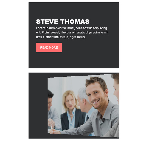
Steve Thomas
Lorem ipsum dolor sit amet, consectetur adipiscing elit. Proin laoreet, libero a venenatis dignissim, enim arcu elementum metus, eget luctus.
Read More<div class="container"> <div class="row"> <div class="col-md-4 col-sm-6"> <div class="box"> <img src="https://fokit.ru/demo/images/hover-effect/hover-effect-style-142/img-1.jpg" alt=""/> <div class="box-content"> <h3 class="title">Williamson</h3> <p class="description"> Lorem ipsum dolor sit amet, consectetur adipiscing elit. Proin laoreet, libero a venenatis dignissim, enim arcu elementum metus, eget luctus. </p> <a href="#" class="read-more">Read More</a> </div> </div> </div> <div class="col-md-4 col-sm-6"> <div class="box"> <img src="https://fokit.ru/demo/images/hover-effect/hover-effect-style-142/img-2.jpg" alt=""/> <div class="box-content"> <h3 class="title">Kristiana</h3> <p class="description"> Lorem ipsum dolor sit amet, consectetur adipiscing elit. Proin laoreet, libero a venenatis dignissim, enim arcu elementum metus, eget luctus. </p> <a href="#" class="read-more">Read More</a> </div> </div> </div> </div> </div>css разметка для реализации данного эффекта
.box{
background: #2f3032;
overflow: hidden;
position: relative;
box-shadow: 0 0 3px rgba(0, 0, 0, 0.3);
-webkit-perspective: 800px;
perspective: 800px;
}
.box img{
width: 100%;
height: auto;
transition: all 0.3s ease-in 0.2s;
}
.box:hover img{
opacity: 0;
transform: rotateY(-100deg) translateX(50%) scale(0.5);
transition-delay: 0;
}
.box .box-content{
width: 100%;
padding: 0 30px;
opacity: 0;
z-index: 1;
position: absolute;
top: 50%;
left: 0;
transform: rotateY(90deg) translate(50%, -50%) scale(0.5);
transition: all 0.3s ease-out 0s;
}
.box:hover .box-content{
opacity: 1;
transform: rotateY(0deg) translate(0, -50%) scale(1);
transition-delay: 0.4s;
}
.box .title{
font-size: 24px;
font-weight: 800;
color: #fff;
line-height: 1.5em;
text-transform: uppercase;
margin: 0;
}
.box .description{
font-size: 12px;
font-weight: 500;
color: #fff;
margin: 0 0 15px;
}
.box .read-more{
display: inline-block;
padding: 10px 16px;
font-size: 12px;
color: #fff;
text-transform: uppercase;
background: #fe6d6d;
overflow: hidden;
z-index: 1;
position: relative;
transition: all 0.3s ease 0s;
}
.box .read-more:after{
content: "";
width: 100%;
height: 0;
position: absolute;
top: 50%;
left: 50%;
opacity: 0;
z-index: -1;
transform: translateX(-50%) translateY(-50%) rotate(45deg);
transition: all 0.3s ease 0s;
}
.box .read-more:hover:after{
height: 170%;
background: #2f3032;
opacity: 1;
}
@media only screen and (max-width:990px){
.box{ margin-bottom: 20px; }
}