
Подробное описание и демонстрацией работы эффекта наведения под номером №128 для бибилиотеки Bootstrap. Html и CSS код для реализации hover effect как на изображении.
Демонстрация эффекта наведения — стиль 128

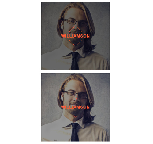
Williamson

Kristiana

Steve Thomas
<div class="container">
<div class="row">
<div class="col-md-4 col-sm-6">
<div class="box">
<img src="https://fokit.ru/demo/images/hover-effect/hover-effect-style-128/img-1.jpg">
<div class="box-content">
<div class="overlay"><div></div></div>
<h3 class="title">Williamson</h3>
</div>
</div>
</div>
<div class="col-md-4 col-sm-6">
<div class="box">
<img src="https://fokit.ru/demo/images/hover-effect/hover-effect-style-128/img-2.jpg">
<div class="box-content">
<div class="overlay"><div></div></div>
<h3 class="title">Kristiana</h3>
</div>
</div>
</div>
</div>
</div>
css разметка для реализации данного эффекта
.box{
text-align: center;
background: #000;
overflow: hidden;
position: relative;
}
.box img{
width: 100%;
height: 100%;
transition: all 0.3s ease-out 0s;
}
.box:hover img{
opacity: 0.4;
transform: scale(1.1);
}
.box .box-content{
width: 100%;
height: 100%;
position: absolute;
top: 0;
left: 0;
}
.box .title{
font-size: 22px;
font-weight: 700;
color: #f95b34;
letter-spacing: 1px;
text-transform: uppercase;
opacity: 0;
margin: 0 0 10px;
position: absolute;
top: 50%;
left: 0;
right: 0;
transform: translateY(-50%);
}
.box:hover .title{
opacity: 1;
}
.box-content .overlay{
width: 78px;
height: 78px;
position: absolute;
top: 50%;
left: 50%;
transform-origin: 0 0;
transform: rotate(45deg) translate(-50%, -50%);
}
.box-content .overlay:before,
.box-content .overlay:after,
.box-content .overlay div:before,
.box-content .overlay div:after{
content: "";
display: block;
position: absolute;
background: #f95b34;
transition: all 0.4s ease-in-out;
}
.box-content .overlay:before,
.box-content .overlay:after{
width: 0;
height: 2px;
}
.box-content .overlay div:before,
.box-content .overlay div:after{
width: 2px;
height: 0;
}
.box-content .overlay:before,
.box-content .overlay div:before{
top: 0;
left: 0;
}
.box-content .overlay:after,
.box-content .overlay div:after{
bottom: 0;
right: 0;
}
.box:hover .overlay:before,
.box:hover .overlay:after{
width: 65%;
}
.box:hover .overlay div:before,
.box:hover .overlay div:after{
height: 65%;
}
@media only screen and (max-width:990px){
.box{ margin-bottom: 30px; }
}