
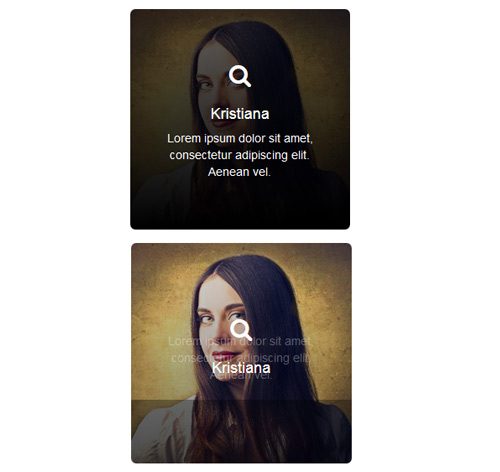
Подробное описание и демонстрацией работы эффекта наведения под номером №121 для бибилиотеки Bootstrap. Html и CSS код для реализации hover effect как на изображении.
Демонстрация эффекта наведения — стиль 121

Williamson
Lorem ipsum dolor sit amet, consectetur adipiscing elit. Aenean vel.

Miranda joy
Lorem ipsum dolor sit amet, consectetur adipiscing elit. Aenean vel.
<div class="container">
<div class="row">
<div class="col-md-3 col-sm-6">
<div class="box">
<img src="https://fokit.ru/demo/images/hover-effect/hover-effect-style-121/img-1.jpg" alt=""/>
<div class="box-content">
<i class="fa fa-search"></i>
<h4 class="title">Williamson</h4>
</div>
<p class="description">
Lorem ipsum dolor sit amet, consectetur adipiscing elit. Aenean vel.
</p>
</div>
</div>

<div class="col-md-3 col-sm-6">
<div class="box">
<img src="https://fokit.ru/demo/images/hover-effect/hover-effect-style-121/img-2.jpg" alt=""/>
<div class="box-content">
<i class="fa fa-search"></i>
<h4 class="title">Kristiana</h4>
</div>
<p class="description">
Lorem ipsum dolor sit amet, consectetur adipiscing elit. Aenean vel.
</p>
</div>
</div>
</div>
</div>
css разметка для реализации данного эффекта
.box{
text-align: center;
border-radius: 6px;
position: relative;
overflow: hidden;
}
.box:after{
content: "";
width: 100%;
height: 100%;
background: rgba(0, 0, 0, 0) linear-gradient(rgba(0, 0, 0, 0), rgba(0, 0, 0, 0.4) 50%, rgba(0, 0, 0, 0.6) 50%, rgba(0, 0, 0, 1)) repeat scroll 0 0 / 100% 202%;
position: absolute;
top: 0;
left: 0;
transition: all 0.3s ease-in-out 0s;
}
.box:hover:after{
background-position: 100% 100%;
}
.box img{
width: 100%;
height: auto;
}
.box .box-content{
width: 100%;
position: absolute;
top: 38%;
left: 0;
z-index: 1;
transition: all 0.3s ease-in-out 0s;
}
.box:hover .box-content{
top: 25%;
}
.box .box-content i{
font-size: 28px;
color: #fff;
}
.box .title{
font-size: 18px;
color: #fff;
padding: 10px;
margin: 10px 0 0;
}
.box .description{
width: 100%;
font-size: 14px;
color: #fff;
padding: 0 30px;
position: absolute;
top: 35%;
left: 0;
opacity: 0;
z-index: 1;
transition: all 0.3s ease-in-out 0s;
}
.box:hover .description{
opacity: 1;
top: 55%;
}
@media only screen and (max-width:990px){
.box{ margin-bottom: 30px; }
}