
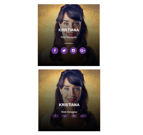
Подробное описание и демонстрацией работы эффекта наведения под номером №118 для бибилиотеки Bootstrap. Html и CSS код для реализации hover effect как на изображении.
Демонстрация эффекта наведения — стиль 118

Williamson
Web Developer
Steve Thomas
заговолокer<div class="container"> <div class="row"> <div class="col-md-4 col-sm-6"> <div class="box"> <img src="https://fokit.ru/demo/images/hover-effect/hover-effect-style-118/img-1.jpg"> <div class="box-content"> <h3 class="title">Williamson</h3> <span class="post">Web Developer</span> <ul class="social"> <li><a href="#"><i class="fab fa-facebook"></i></a></li> <li><a href="#"><i class="fab fa-twitter"></i></a></li> <li><a href="#"><i class="fab fa-instagram"></i></a></li> <li><a href="#"><i class="fab fa-google-plus"></i></a></li> </ul> </div> </div> </div> <div class="col-md-4 col-sm-6"> <div class="box"> <img src="https://fokit.ru/demo/images/hover-effect/hover-effect-style-118/img-2.jpg"> <div class="box-content"> <h3 class="title">Kristiana</h3> <span class="post">Web Designer</span> <ul class="social"> <li><a href="#"><i class="fab fa-facebook"></i></a></li> <li><a href="#"><i class="fab fa-twitter"></i></a></li> <li><a href="#"><i class="fab fa-instagram"></i></a></li> <li><a href="#"><i class="fab fa-google-plus"></i></a></li> </ul> </div> </div> </div> </div> </div>css разметка для реализации данного эффекта
.box{
text-align: center;
overflow: hidden;
color: #fff;
position: relative;
}
.box:after{
content: "";
width: 100%;
height: 100%;
background: linear-gradient(to bottom, rgba(0, 0, 0, 0) 0%, rgba(0, 0, 0, 0.08) 69%, rgba(0, 0, 0, 0.76) 100%);
position: absolute;
top: 0;
left: 0;
transition: all 0.5s ease 0s;
}
.box:hover:after{
background: linear-gradient(to bottom, rgba(0, 0, 0, 0.01) 0%, rgba(0, 0, 0, 0.09) 11%, rgba(0, 0, 0, 0.12) 13%, rgba(0, 0, 0, 0.19) 20%, rgba(0, 0, 0, 0.29) 28%, rgba(0, 0, 0, 0.29) 29%, rgba(0, 0, 0, 0.42) 38%, rgba(0, 0, 0, 0.46) 43%, rgba(0, 0, 0, 0.53) 47%, rgba(0, 0, 0, 0.75) 69%, rgba(0, 0, 0, 0.87) 84%, rgba(0, 0, 0, 0.98) 99%, rgba(0, 0, 0, 0.94) 100%);
}
.box img{
width: 100%;
height: auto;
}
.box .box-content{
width: 100%;
padding: 20px;
margin-bottom: 20px;
position: absolute;
bottom: 0;
left: 0;
z-index: 1;
}
.box .title{
font-size: 22px;
font-weight: 700;
text-transform: uppercase;
margin: 0 0 10px 0;
transform: translateY(145px);
transition: all 0.4s cubic-bezier(0.13, 0.62, 0.81, 0.91) 0s;
}
.box .post{
display: block;
padding: 8px 0;
font-size: 15px;
transform: translateY(145px);
transition: all 0.4s cubic-bezier(0.13, 0.62, 0.81, 0.91) 0s;
}
.box:hover .title,
.box:hover .post{
transform: translateY(0);
}
.box .social{
list-style: none;
padding: 0 0 5px 0;
margin: 40px 0 25px;
opacity: 0;
position: relative;
transform: perspective(500px) rotateX(-90deg) rotateY(0deg) rotateZ(0deg);
transition: all 0.6s cubic-bezier(0, 0, 0.58, 1) 0s;
}
.box:hover .social{
opacity: 1;
transform: perspective(500px) rotateX(0deg) rotateY(0deg) rotateZ(0deg);
}
.box .social:before{
content: "";
width: 50px;
height: 2px;
background: #fff;
margin: 0 auto;
position: absolute;
top: -23px;
left: 0;
right: 0;
}
.box .social li{
display: inline-block;
}
.box .social li a{
display: block;
width: 40px;
height: 40px;
line-height: 40px;
border-radius: 50%;
background: #6d3795;
font-size: 20px;
color: #fff;
margin-right: 10px;
transition: all 0.3s ease 0s;
}
.box .social li a:hover{
background: #bea041;
}
.box .social li:last-child a{
margin-right: 0;
}
@media only screen and (max-width:990px){
.box{ margin-bottom: 30px; }
}