
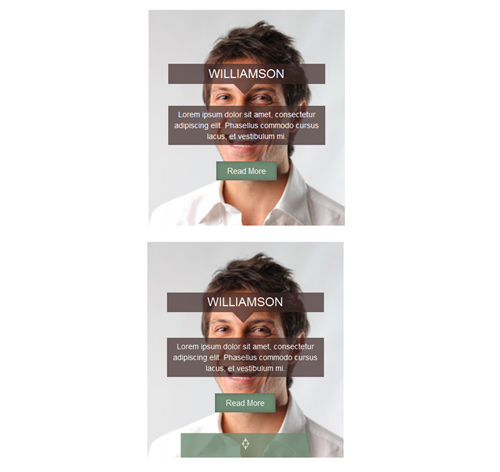
Подробное описание и демонстрацией работы эффекта наведения под номером №114 для бибилиотеки Bootstrap. Html и CSS код для реализации hover effect как на изображении.
Демонстрация эффекта наведения — стиль 114


<div class="container">
<div class="row">
<div class="col-md-4 col-sm-6">
<div class="box">
<img src="https://fokit.ru/demo/images/hover-effect/hover-effect-style-114/img-1.jpg" alt=""/>
<div class="icon">
<i class="fa fa-crosshairs"></i>
</div>
<div class="box-content">
<h4 class="title">Williamson</h4>
<p class="description">Lorem ipsum dolor sit amet, consectetur adipiscing elit. Phasellus commodo cursus lacus, et vestibulum mi.</p>
<a class="read-more" href="#">read more</a>
</div>
</div>
</div>

<div class="col-md-4 col-sm-6">
<div class="box">
<img src="https://fokit.ru/demo/images/hover-effect/hover-effect-style-114/img-2.jpg" alt=""/>
<div class="icon">
<i class="fa fa-crosshairs"></i>
</div>
<div class="box-content">
<h4 class="title">Kristiana</h4>
<p class="description">Lorem ipsum dolor sit amet, consectetur adipiscing elit. Phasellus commodo cursus lacus, et vestibulum mi.</p>
<a class="read-more" href="#">read more</a>
</div>
</div>
</div>
</div>
</div>
css разметка для реализации данного эффекта
.box{
text-align: center;
overflow: hidden;
position: relative;
}
.box img{
width: 110%;
height: auto;
transform: translate(-8%,0);
transition: all 0.15s linear 0s;
}
.box:hover img{
transform: translate(0,0);
}
.box .icon{
width: 100%;
height: 45px;
line-height: 45px;
background: rgba(111,139,116,0.8);
position: absolute;
bottom: 0;
left: 0;
transition: all 0.15s linear 0s;
}
.box:hover .icon{
transform: scaleX(0);
transition-delay: 0.1s;
}
.box .icon i{
font-size: 24px;
color: #fff;
transition: all 0.01s linear 0s;
}
.box:hover .icon i{
transition-delay: 0.1s;
opacity: 0;
}
.box .box-content{
width: 100%;
height: 100%;
position: absolute;
top: 0;
left: 0;
}
.box .title{
width: 80%;
padding: 6px 0;
margin: 40px auto 0;
background: rgba(62,40,39,0.7);
font-size: 22px;
font-weight: 400;
color: #fff;
text-transform: uppercase;
position: relative;
top: -100%;
transition: all 0.2s cubic-bezier(0.41, 1.43, 0.19, 0.79) 0s;
}
.box:hover .title{
transition-delay: 0.5s;
}
.box .title:before{
content: "";
display: block;
border: 20px solid transparent;
border-top: 20px solid rgba(62,40,39,0.7);
position: absolute;
top: 100%;
left: 42%;
}
.box .description{
width: 80%;
padding: 6px 10px;
margin: 40px auto 0;
background: rgba(62,40,39,0.7);
font-size: 14px;
font-weight: 400;
color: #fff;
position: relative;
top: -100%;
transition: all 0.2s cubic-bezier(0.41, 1.43, 0.19, 0.79) 0s;
}
.box:hover .description{
transition-delay: 0.4s;
}
.box .read-more{
display: inline-block;
padding: 7px 20px;
margin: 30px auto 0;
background: #6f8b74;
font-size: 15px;
color: #fff;
text-transform: capitalize;
box-shadow: inset 0 0 7px 1px rgba(0,0,0,0.2);
position: relative;
top: -100%;
transition: all 0.2s cubic-bezier(0.41, 1.43, 0.19, 0.79) 0s;
}
.box .read-more:hover{
border-radius: 10px;
}
.box:hover .read-more{
transition-delay: 0.3s;
}
.box:hover .title,
.box:hover .description,
.box:hover .read-more{
top: 15%;
}
@media only screen and (max-width:990px){
.box{ margin-bottom: 30px; }
}
@media only screen and (max-width:360px){
.box:hover .title,
.box:hover .description,
.box:hover .read-more{
top: 5%;
}
}