
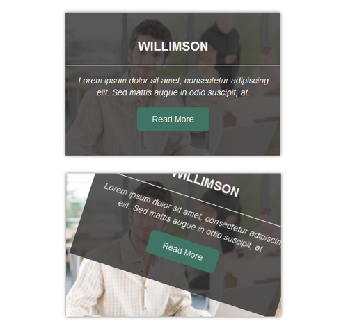
Подробное описание и демонстрацией работы эффекта наведения под номером №103 для бибилиотеки Bootstrap. Html и CSS код для реализации hover effect как на изображении.


<div class="container">
<div class="row">
<div class="col-md-4 col-sm-6">
<div class="box">
<img src="https://fokit.ru/demo/images/hover-effect/hover-effect-style-103/img-1.jpg" alt=""/>
<div class="box-content">
<h4 class="title">willimson</h4>
<p class="description">Lorem ipsum dolor sit amet, consectetur adipiscing elit. Sed mattis augue in odio suscipit, at.</p>
<a class="read-more" href="#">read more</a>
</div>
</div>
</div>

<div class="col-md-4 col-sm-6">
<div class="box">
<img src="https://fokit.ru/demo/images/hover-effect/hover-effect-style-103/img-2.jpg" alt=""/>
<div class="box-content">
<h4 class="title">Kristiana</h4>
<p class="description">Lorem ipsum dolor sit amet, consectetur adipiscing elit. Sed mattis augue in odio suscipit, at.</p>
<a class="read-more" href="#">read more</a>
</div>
</div>
</div>
</div>
</div>
css разметка для реализации данного эффекта
.box{
text-align: center;
overflow: hidden;
position: relative;
box-shadow: 0 0 5px #7e7d7d;
}
.box img{
width: 100%;
height: auto;
-moz-transform: scale(1);
-o-transform: scale(1);
-webkit-transform: scale(1);
-ms-transform: scale(1);
transform: scale(1);
-o-transition: all 0.25s linear 0.3s;
-moz-transition: all 0.25s linear 0.3s;
-webkit-transition: all 0.25s linear 0.3s;
-ms-transition: all 0.25s linear 0.3s;
transition: all 0.25s linear 0.3s;
}
.box:hover img{
-moz-transform: scale(1.3);
-o-transform: scale(1.3);
-webkit-transform: scale(1.3);
-ms-transform: scale(1.3);
transform: scale(1.3);
-moz-transition-delay: 0s;
-webkit-transition-delay: 0s;
-o-transition-delay: 0s;
-ms-transition-delay: 0s;
transition-delay: 0s;
}
.box .box-content{
width: 100%;
height: 100%;
background: rgba(48, 47, 47, 0.8);
position: absolute;
top: 0;
left: 0;
color: #fff;
opacity: 0;
padding-top: 25px;
-moz-transform: rotate(30deg) translate(30px,-89px);
-webkit-transform: rotate(30deg) translate(30px,-89px);
-ms-transform: rotate(30deg) translate(30px,-89px);
-o-transform: rotate(30deg) translate(30px,-89px);
transform: rotate(30deg) translate(30px,-89px);
-o-transition: transform 0.35s cubic-bezier(0.49, -0.19, 0.7, -0.01) 0.1s, opacity 0.1s linear 0s;
-moz-transition: transform 0.35s cubic-bezier(0.49, -0.19, 0.7, -0.01) 0.1s, opacity 0.1s linear 0s;
-webkit-transition: transform 0.35s cubic-bezier(0.49, -0.19, 0.7, -0.01) 0.1s, opacity 0.1s linear 0s;
-ms-transition: transform 0.35s cubic-bezier(0.49, -0.19, 0.7, -0.01) 0.1s, opacity 0.1s linear 0s;
transition: transform 0.35s cubic-bezier(0.49, -0.19, 0.7, -0.01) 0.1s, opacity 0.1s linear 0s;
}
.box:hover .box-content{
opacity: 1;
-webkit-transform: rotate(0deg) translate(0px,0px);
-o-transform: rotate(0deg) translate(0px,0px);
-moz-transform: rotate(0deg) translate(0px,0px);
-ms-transform: rotate(0deg) translate(0px,0px);
transform: rotate(0deg) translate(0px,0px);
-moz-transition-delay: 0.3s;
-webkit-transition-delay: 0.3s;
-o-transition-delay: 0.3s;
-ms-transition-delay: 0.3s;
transition-delay: 0.3s;
}
.box .title{
font-size: 21px;
font-weight: 700;
text-transform: uppercase;
border-bottom: 1px solid #fff;
padding-bottom: 20px;
margin-top: 20px;
}
.box .description{
font-size: 14px;
font-style: italic;
margin: 15px 0;
padding: 0 10px;
}
.box .read-more{
display: block;
width: 120px;
border-radius: 5px;
background: #407464;
font-size: 14px;
color: #fff;
text-transform: capitalize;
padding: 10px 0;
margin: 0 auto;
}
@media only screen and (max-width:990px){
.box{ margin-bottom: 30px; }
}
@media only screen and (max-width:479px){
.box .box-content{ padding-top: 0; }
}
@media only screen and (max-width:360px){
.box .title{
margin-top: 10px;
padding-bottom: 10px;
}
}